
Caso de estudioCase study · 2026
Spleasure
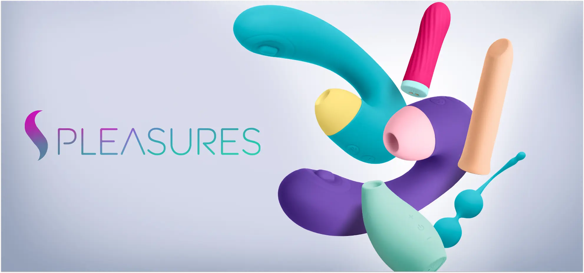
Un logotipo, un isotipo y nueve líneas de producto con código cromático propio: una sola marca, del packaging al feed.One logotype, one symbol and nine product lines with their own colour code: a single brand, from packaging to feed.
01Contexto y retoContext and challenge
Sofisticación en un catálogo sin límites.Sophistication across an endless catalogue.
Spleasure tiene un catálogo amplio y heterogéneo: de piezas metálicas técnicas a lencería, kits de regalo y masajeadores premium. El reto no era diseñar un producto, sino un sistema capaz de dar una identidad coherente a nueve líneas sin que ninguna se disolviera en las demás.Spleasure has a broad, mixed catalogue: from technical metal pieces to lingerie, gift kits and premium massagers. The challenge wasn't designing a product but a system that gives nine lines a coherent identity without any of them dissolving into the others.
En un sector donde buena parte de la competencia recurre a un lenguaje visual genérico, la marca tenía que verse como una firma de bienestar y estilo de vida, y sostener esa sofisticación en cajas, impresos, publicaciones y contenido digital.In an industry where much of the competition relies on generic visuals, the brand had to look like a wellness and lifestyle label — and keep that sophistication across boxes, print, publications and digital content.
02Dolores y oportunidadesPains and opportunities
De la dispersión al sistema.From scattered to systematic.
DoloresPains
- Un catálogo tan amplio que corría el riesgo de perder cohesiónA catalogue so broad it risked losing cohesion
- Percepción genérica o poco premium, habitual en el sectorA generic, non-premium look, common in the industry
- Materiales muy distintos (metal, silicona, encaje) difíciles de unificarVery different materials (metal, silicone, lace) that are hard to unify
- Comunicar en redes sin caer en lo explícitoCommunicating on social without being explicit
OportunidadesOpportunities
- Un logotipo base y la «S» fluida como hilo conductorA base logotype and the flowing “S” as the common thread
- Un código cromático por línea: personalidad sin fragmentarOne colour code per line: personality without fragmentation
- Packaging minimalista y cuidado como experiencia de aperturaMinimal, careful packaging as an unboxing experience
- Una dirección de arte coherente en todos los soportesConsistent art direction across every medium
Un logotipo, nueve personalidades.One logotype, nine personalities.
03Arquitectura de submarcasSub-brand architecture
Cada línea habla su idioma sin salirse del sistema.Each line speaks its own language within the system.
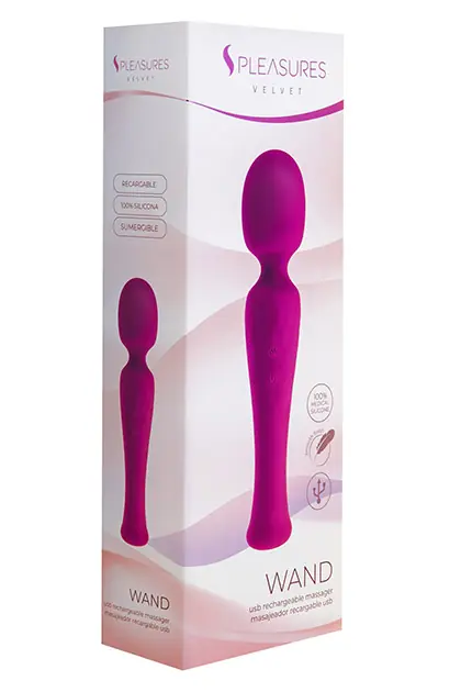
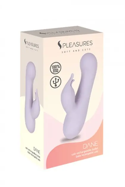
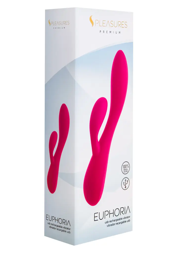
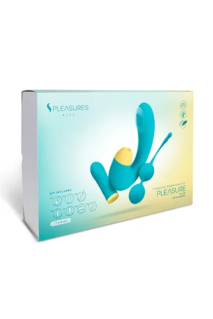
El logotipo base se mantiene constante, siempre acompañado del isotipo de la «S» fluida; lo que cambia es el tono cromático y el subtítulo de cada categoría. Así todo el catálogo se reconoce como uno, y cada línea se reconoce por sí sola. Toda la familia usa una única tipografía, EasyJet Rounded, cercana y legible de la etiqueta a la presentación.The base logotype stays constant, always paired with the flowing “S” symbol; what changes is each category's colour and subtitle. The whole catalogue reads as one, and each line is recognisable on its own. The family uses a single typeface, EasyJet Rounded — warm and legible from label to presentation.
LingerieMagenta y púrpura: moda íntima y seducciónMagenta and purple: intimate fashion
CrystalAzul limpio: materiales traslúcidos, purezaClean blue: translucent materials, purity
BulletsGrafito: piezas compactas y discretasGraphite: compact, discreet pieces
Soft & CutePastel difuminado: suavidad y cercaníaSoft pastel blur: gentle and approachable
PremiumDorado: la gama alta, exclusividadGold: the top range, exclusivity
MetalBlanco sobre gris: solidez industrialWhite on grey: industrial strength
VelvetRosa terroso: tacto suave, calidezEarthy pink: soft touch, warmth
ClassicGris neutro: el ancla del sistemaNeutral grey: the system's anchor
KitsVioleta profundo: sets y regalosDeep violet: sets and gifts
04Packaging
El unboxing como experiencia de marca.Unboxing as a brand experience.
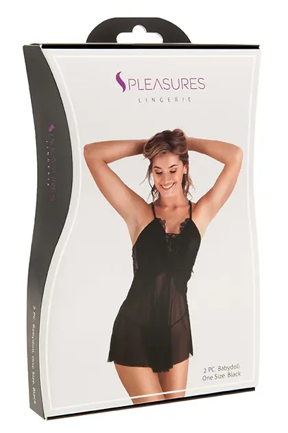
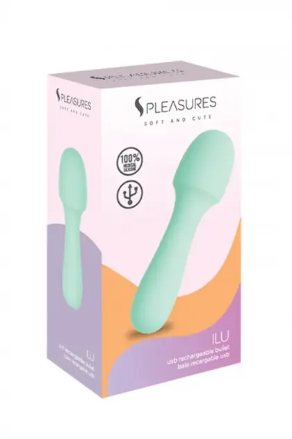
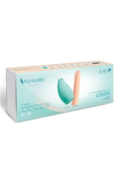
Cajas que integran la identidad con armonía y destacan cada gama: fondo limpio, la «S» siempre presente, el color de la línea como firma y un cuidado extremo en los detalles para que abrirla se sienta como parte del producto.Boxes that carry the identity with restraint and set each range apart: a clean background, the “S” always present, the line's colour as a signature and extreme care in the details, so opening it feels part of the product.

05Dirección de arte y campañasArt direction and campaigns
Un sistema, distintos registros.One system, different registers.
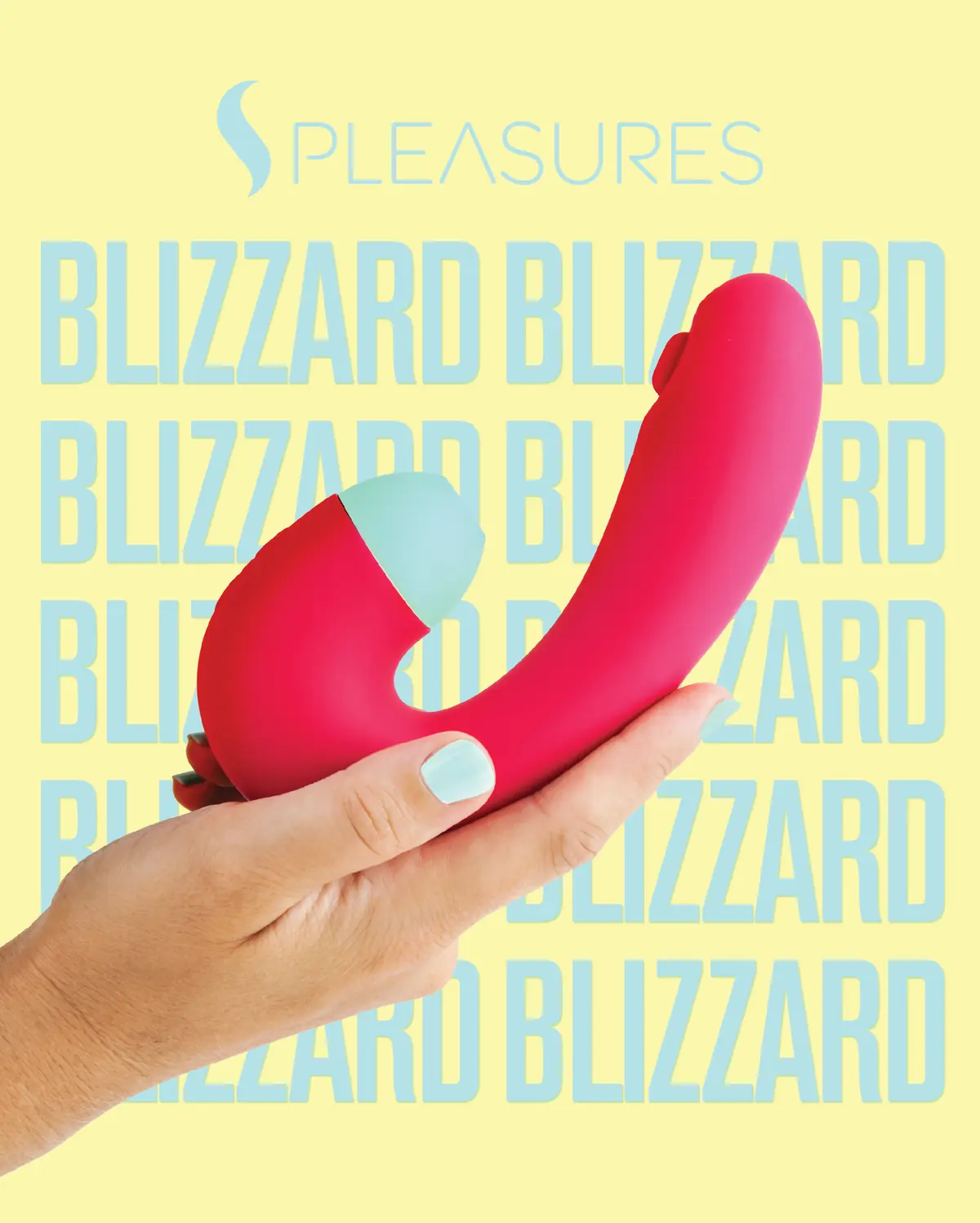
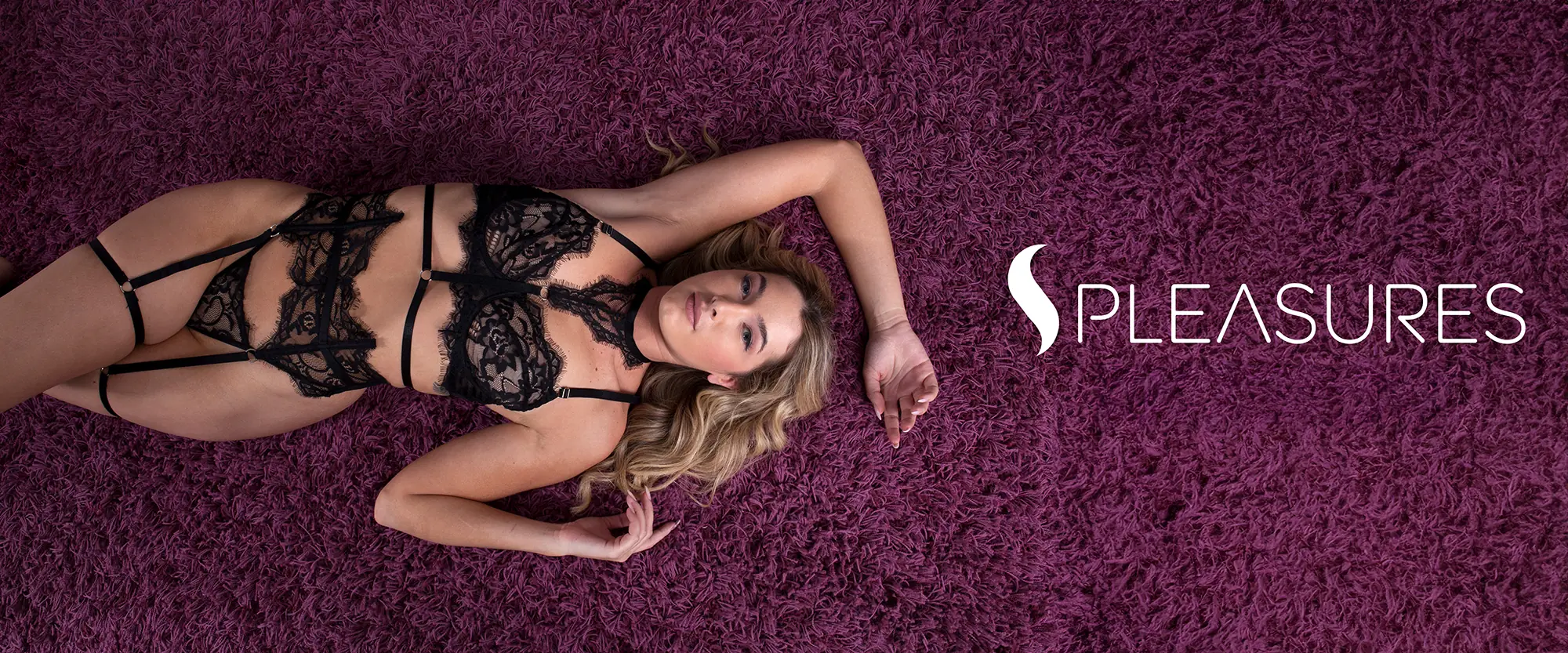
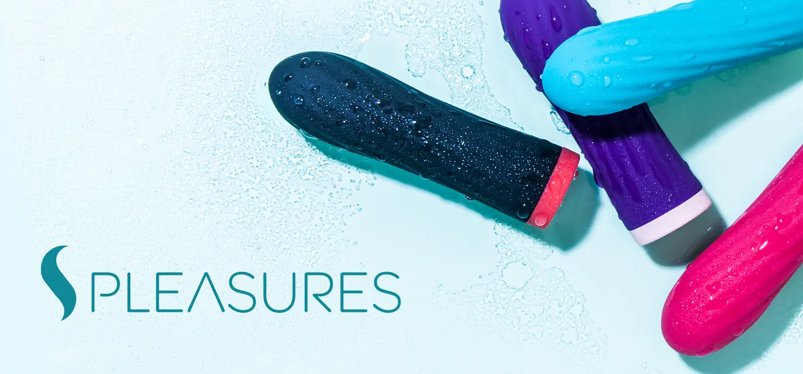
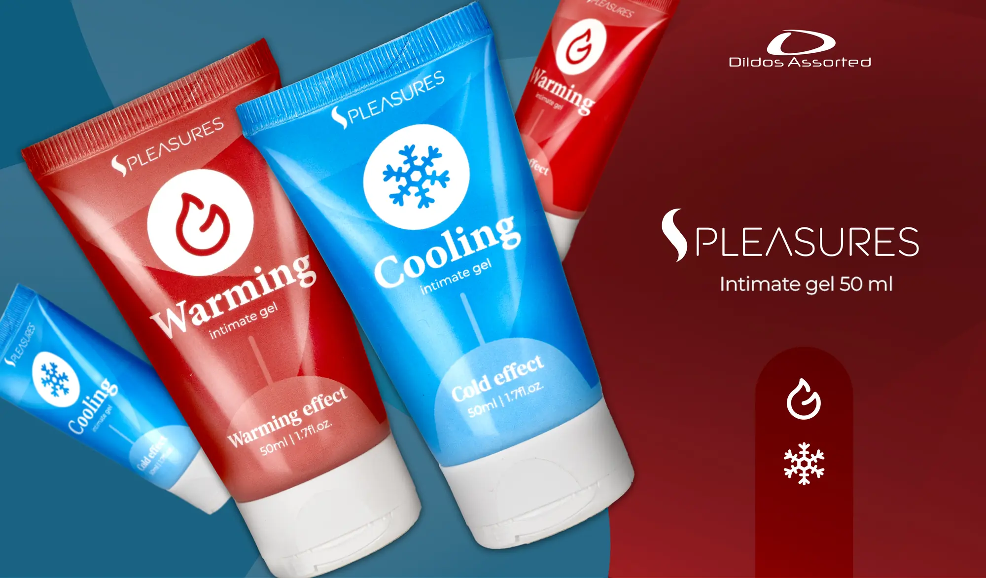
El mismo lenguaje se adapta a tonos muy distintos: lúdico y pop en campañas de producto, sensorial en la fotografía de ambiente, editorial en la lencería y funcional en el punto de venta para distribuidores.The same language adapts to very different tones: playful and pop in product campaigns, sensorial in mood photography, editorial for lingerie and functional at the point of sale for distributors.

06ResultadoOutcome
Nueve líneas, un solo carácter.Nine lines, one character.
La diversidad de un catálogo no tiene por qué fragmentar la identidad: un logotipo base, un isotipo constante y un código de color por línea permiten que cada producto hable su idioma sin dejar de pertenecer al mismo sistema.A diverse catalogue doesn't have to fragment the identity: a base logotype, a constant symbol and a colour code per line let every product speak its own language while belonging to the same system.
El sistema llega también a la maquetación editorial y al feed de Instagram, donde la marca se cuenta con escenas de estilo de vida y luz cálida.The system also reaches editorial layouts and the Instagram feed, where the brand is told through lifestyle scenes and warm light. Ver sus publicacionesSee its posts →
El siguiente proyecto
Hagamos crecer tu marca.
Cuéntanos en qué punto está tu marca y diseñamos juntos el siguiente paso.